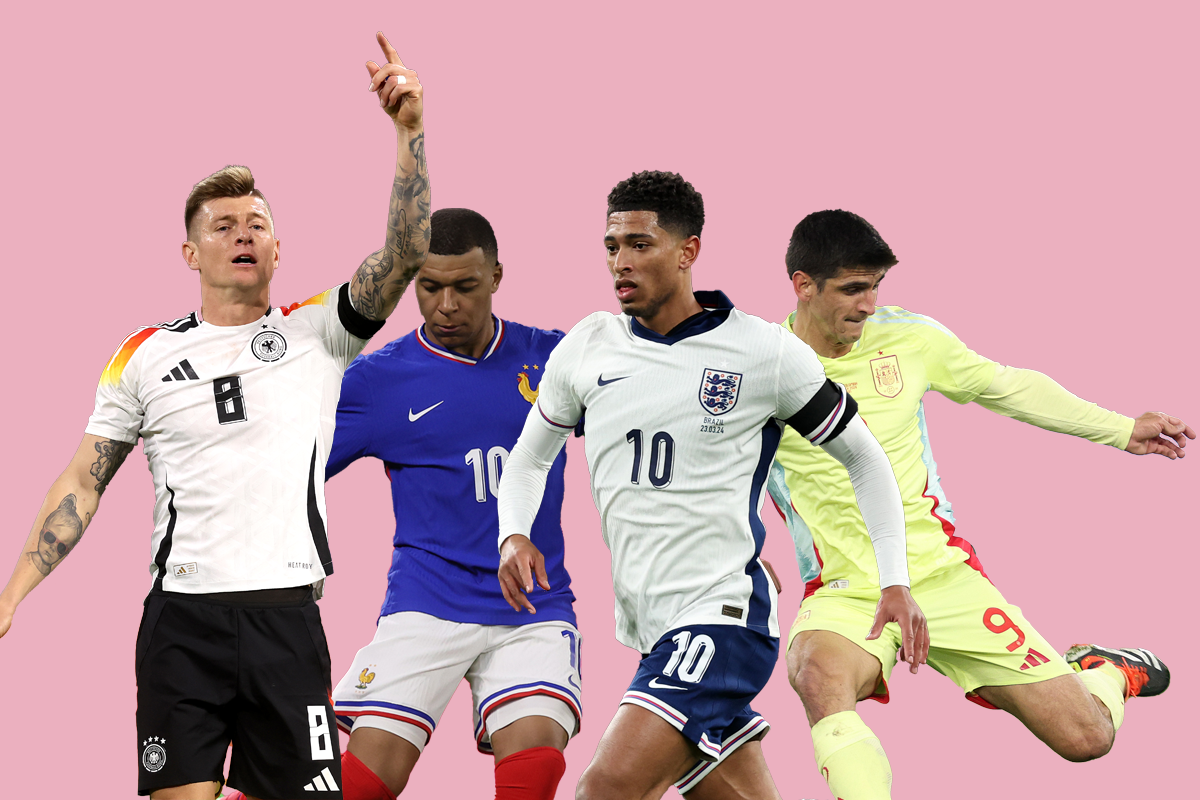
Euro 2024 is nearly upon us and with it comes a sartorial smorgasbord for us to enjoy, or be deeply offended by.
What have Croatia done this time? Have England pulled off a genuine gem? Why are Belgium wearing brown shorts? And which kit has won our highly coveted top spot?
Nike, Adidas, Puma, Macron, Joma and the good people at Hummel have dropped their designs so, without further ado, let’s get stuck in.
Ranked from the visually upsetting to the optically arousing, here is our list of Euro 2024 kits.
Netherlands away
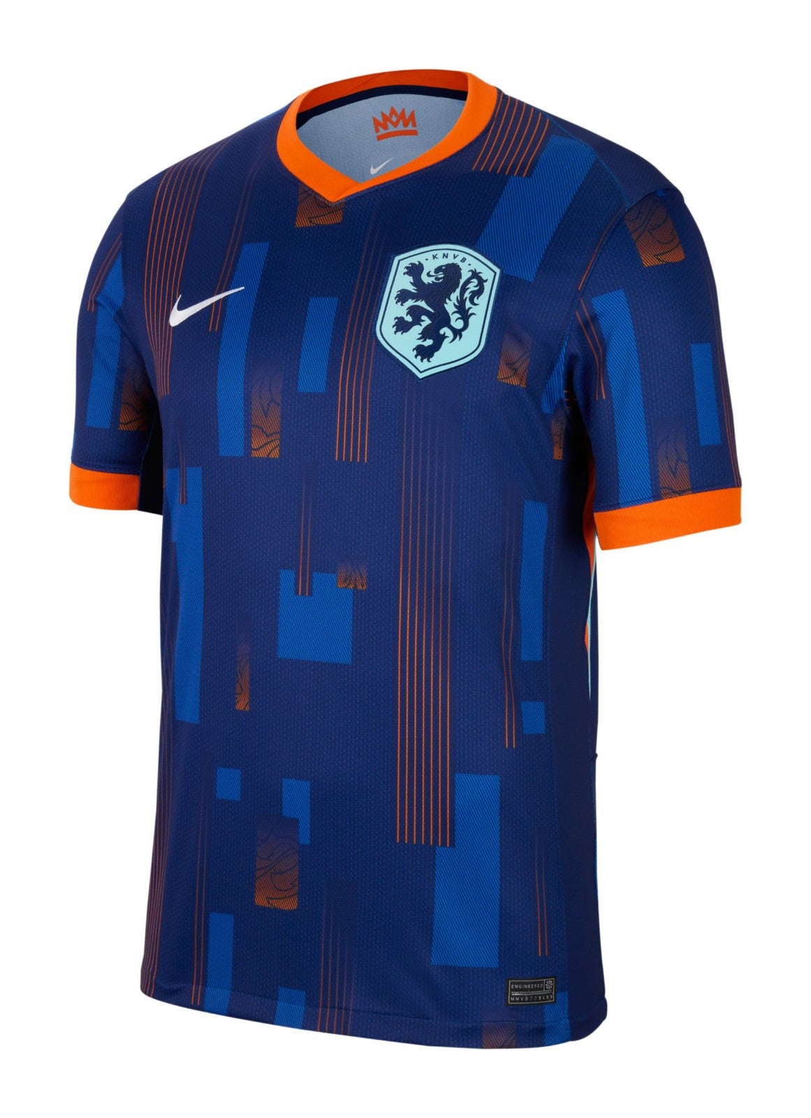
The Dutch have a long history of elite attire but unfortunately this is not a pattern for a football shirt and looks like a Travelodge curtain. We briefly wondered if it’s so bad that it’s actually good, and concluded it is not.
Croatia home
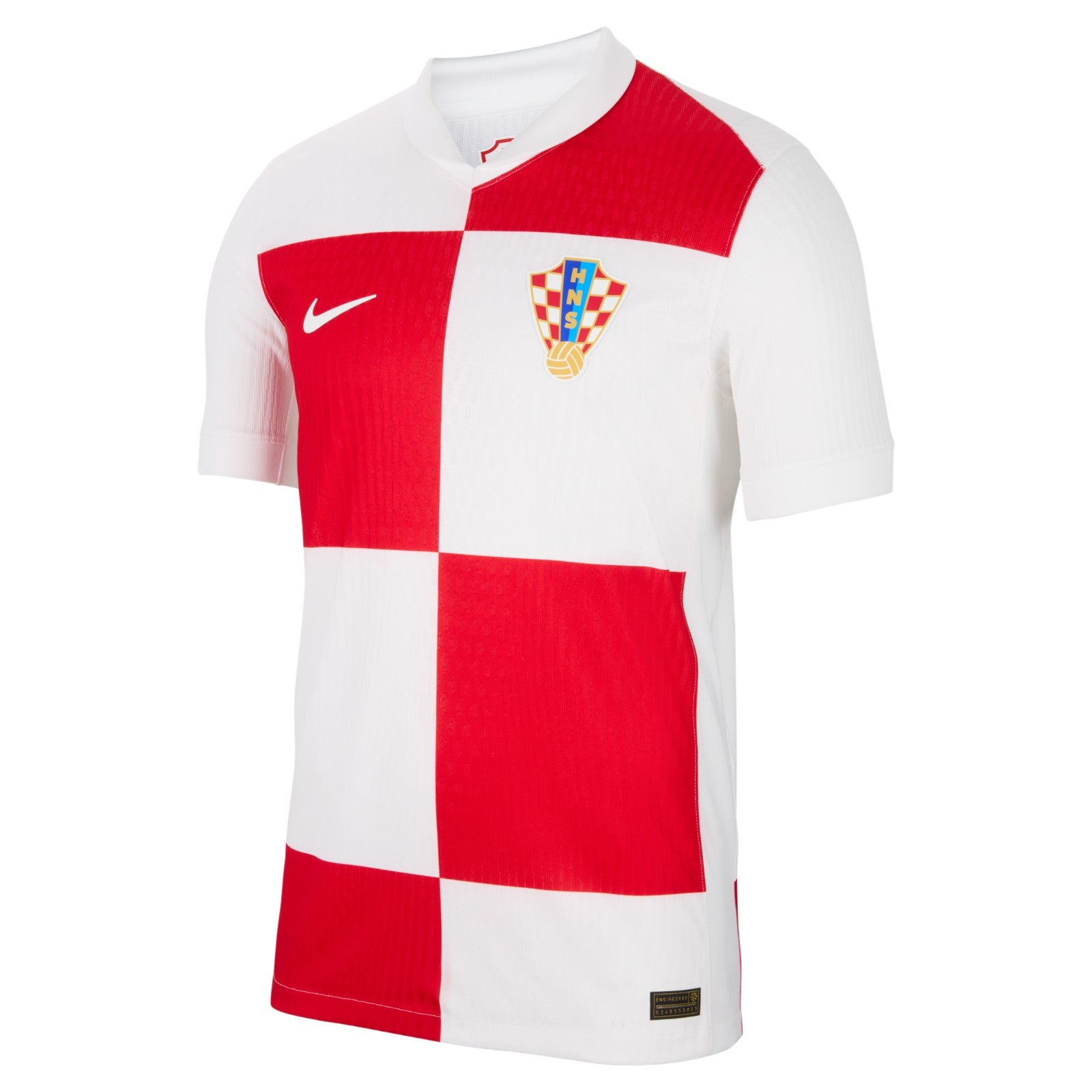
Oh dear. Croatia Home is not hard, people: lots of little red and white checks! This is now two tournaments in a row that they’ve missed the brief and it’s not melodramatic to say that summer is ruined.
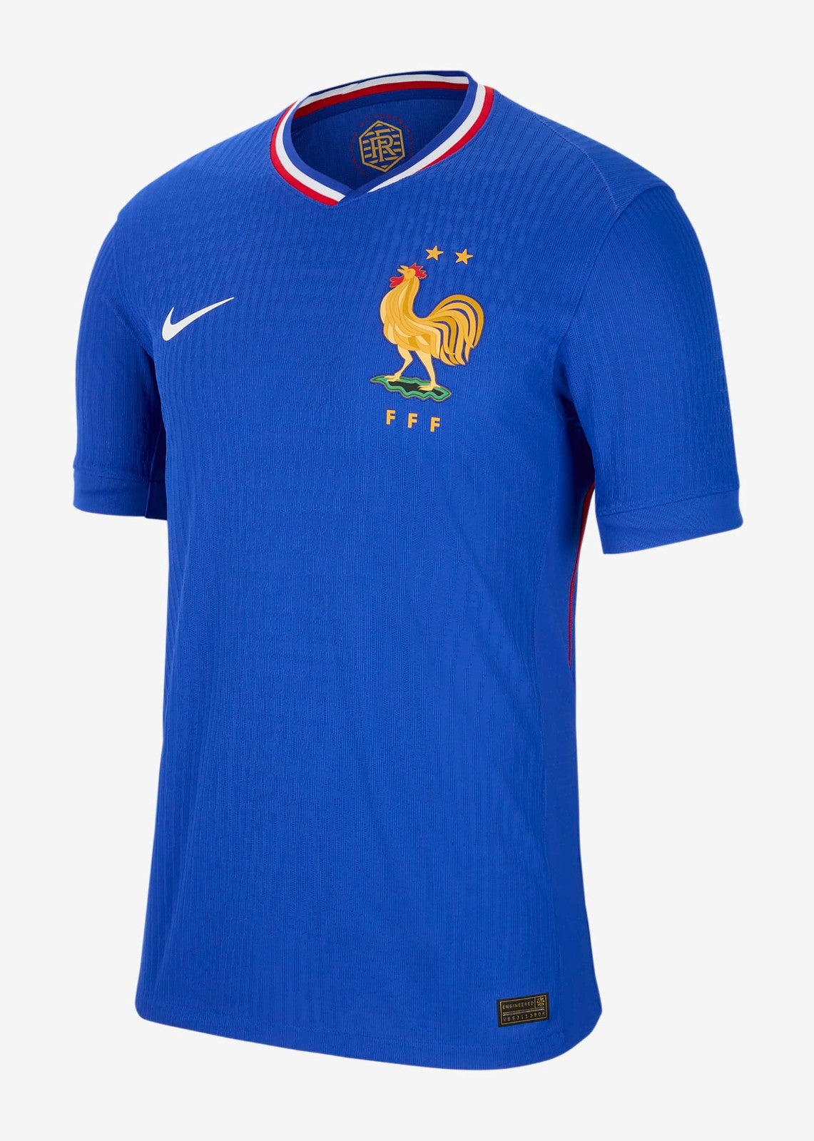
France home
This kit has got a lot of love on social media but we’re just going to come out and say it – it’s all wrong. France have flipped back to a royal blue from the deep, darker blue and it’s just not as menacing. This is supposed to be a nod to the kits of the 1960s, but the actual retro shirts are always better than their modern mimics. The lack of symmetry in the collar is giving us shivers, and don’t get us started on the comically sized cockerel…
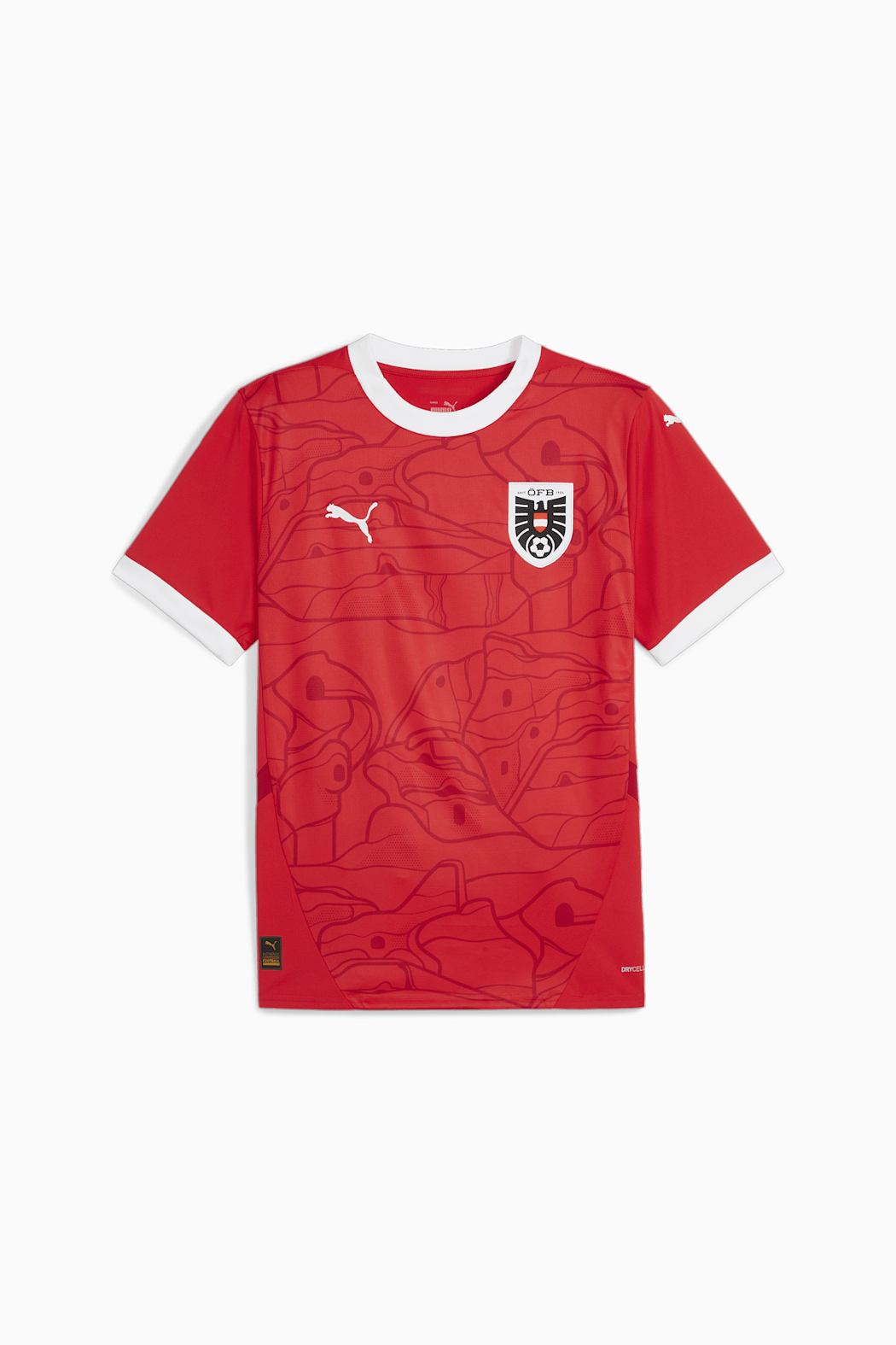
Austria home
After some early entrants from Nike, here’s one by Puma. We’ve stared deep into the beguiling pattern on this shirt and are still no closer to understanding exactly what it is meant to be. It’s unnerving.
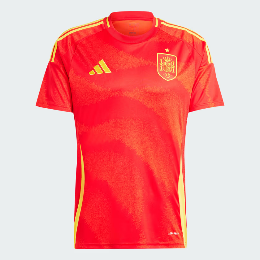
Spain home
Our first shirt from Adidas and we have a question: is this Spanish red? is it?! No. It’s verging on Dutch orange. Take it away.
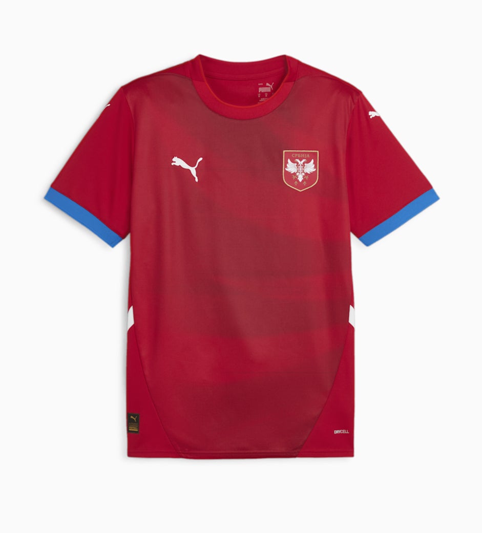
Serbia home
Another Puma shirt which is broadly fine, although the blue sleeve trim feels wrong somehow.
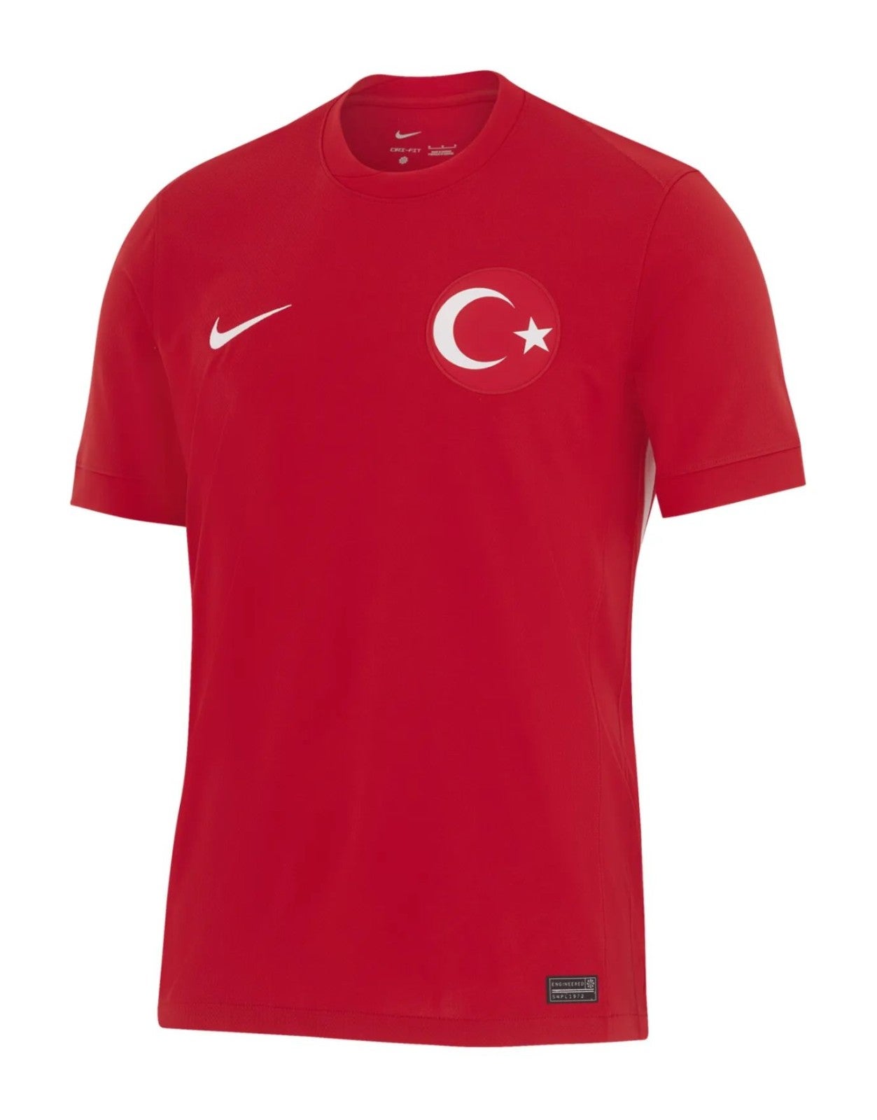
Turkey away
Inoffensive but a bit simplistic. Next.
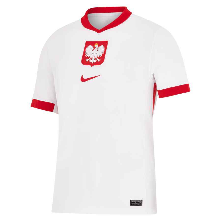
Poland home
Desperately mustering the energy to critique this, but it is essentially a plain white T-shirt.
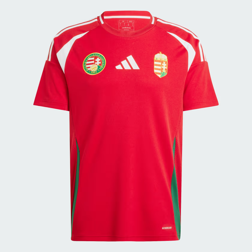
Hungary home
Bright. Too bright? We move on.
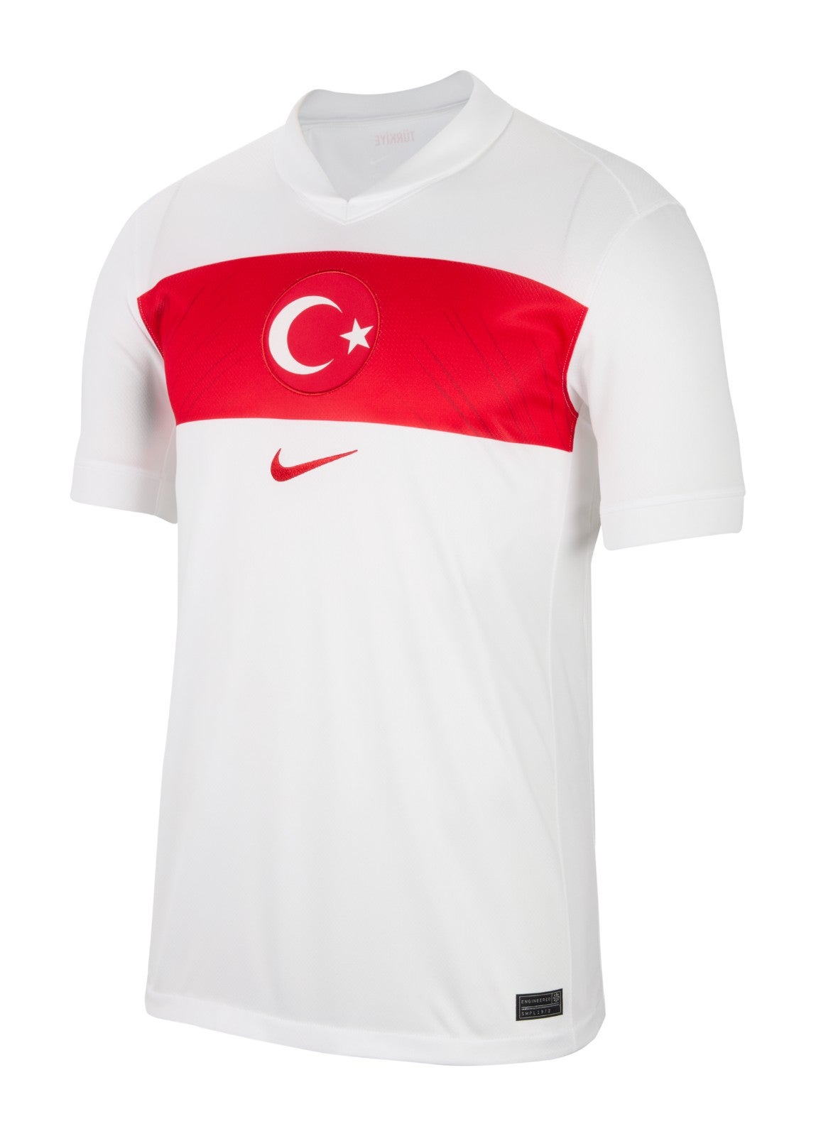
Turkey home
What we are calling the ‘horizontal sash’ is quite pleasing, but this shirt is otherwise a bit bare.
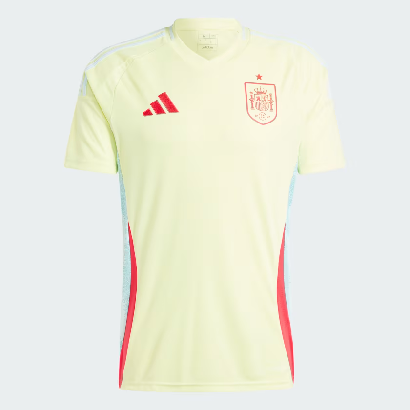
Spain away
The colour is almost putrid and would not suit the paler complexion, but you just know Alvaro Morata is still going to look handsome missing one-on-ones in this thing.
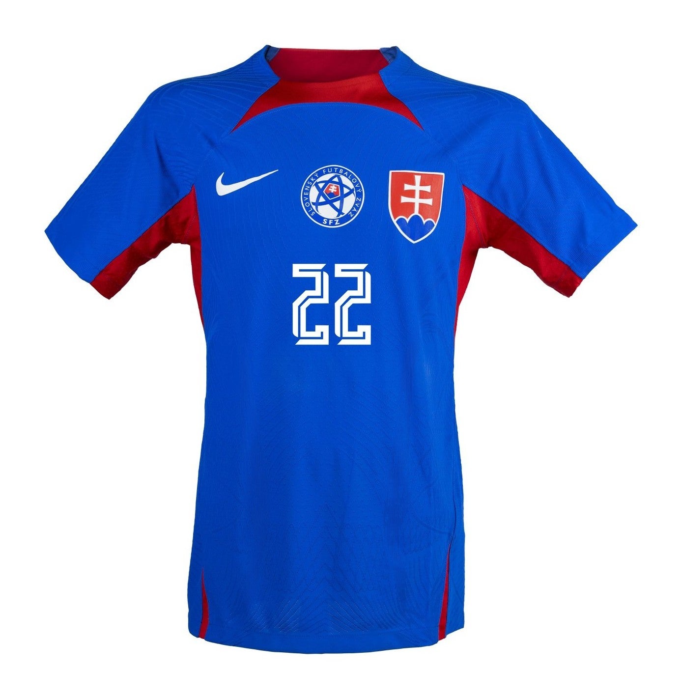
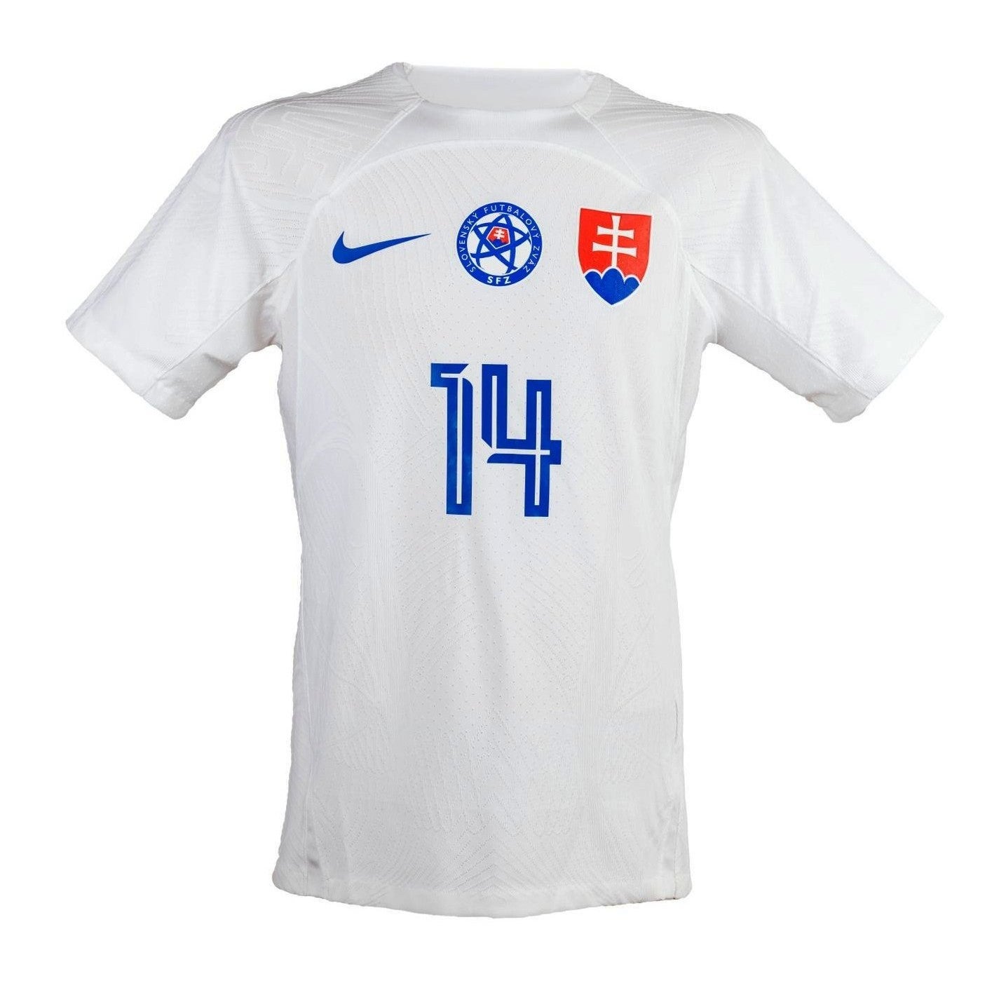
Slovakia home & away
The two-crest offering is as strong as ever from Slovakia, though neither shirt particularly sparkles.
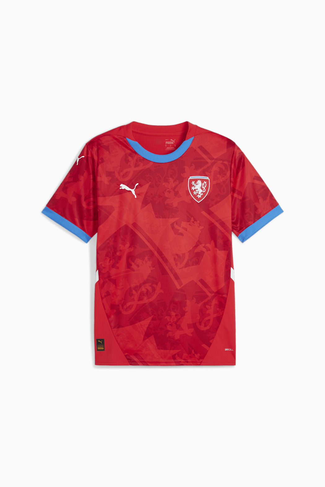
Czech Republic home
Another intense Puma offering much like Austria’s home shirt. Once again, the background pattern is a little bit overbearing.
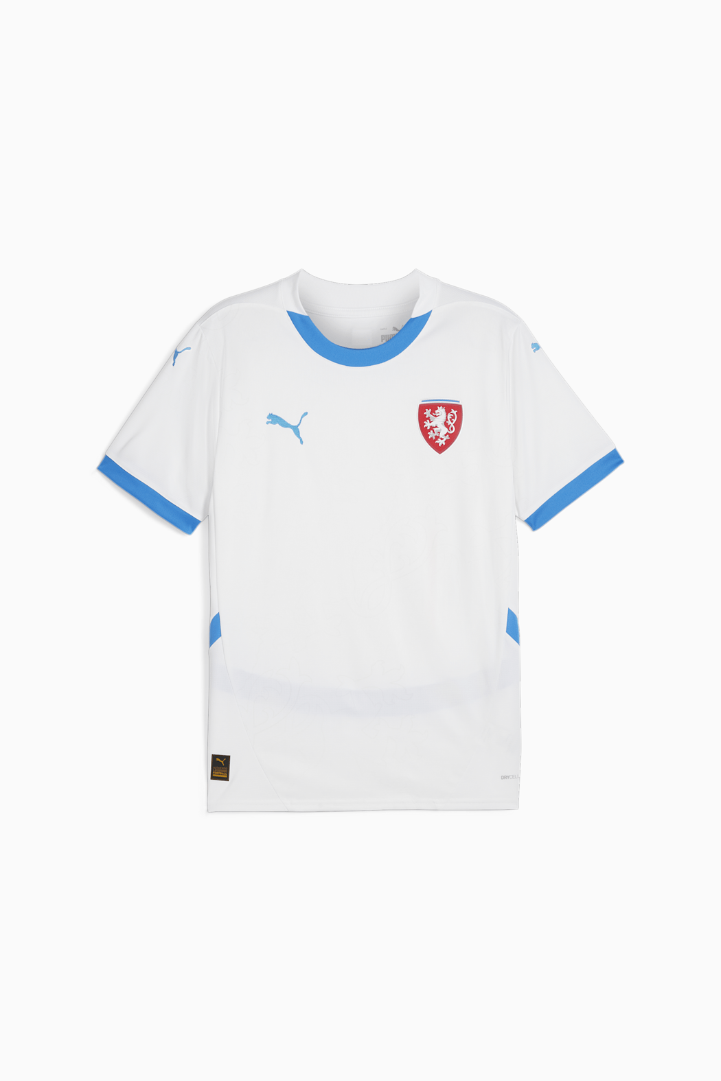
Czech Republic away
There is very little to separate this from the home kit, other than the fact that there is no background pattern and thus this is not overbearing. If anything, a bit underbearing.
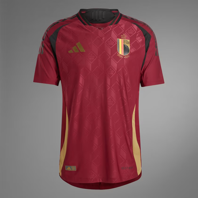
Belgium home
The black lines around the shoulder and armpit give this a slight ‘shirt bought from prosoccerUK to play five-a-side’ energy, but the subtle diamond background saves it from being a flop.
Hungary away
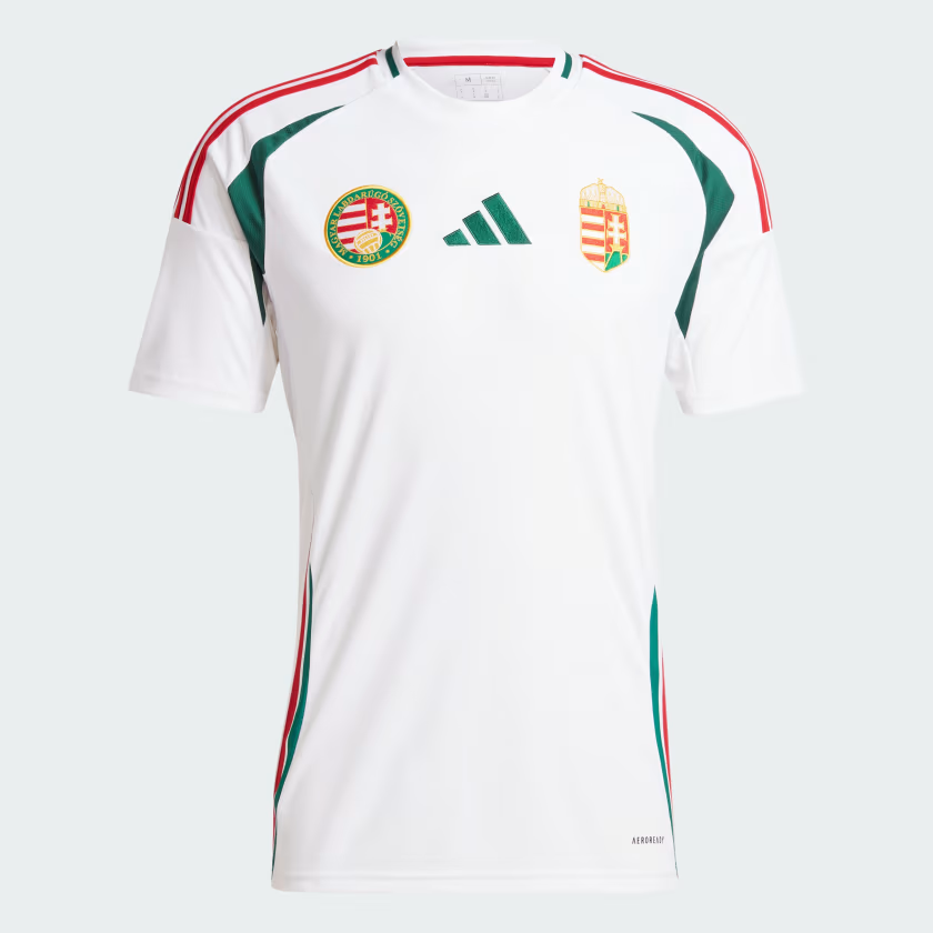
Pleasant. No further comments.
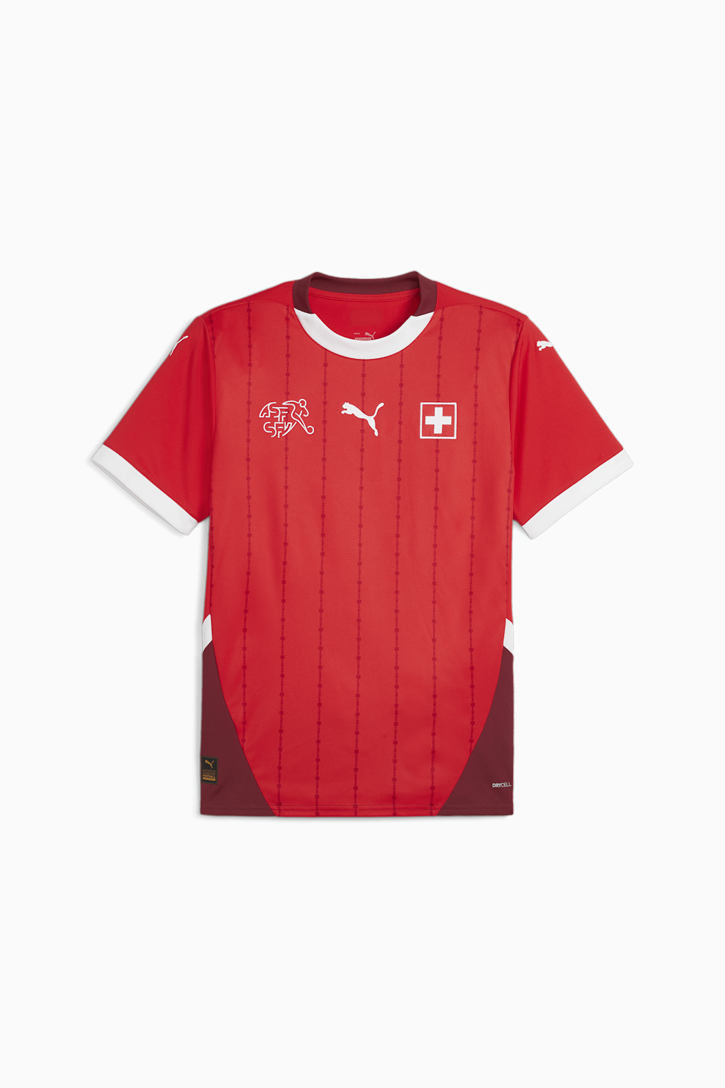
Switzerland home
The barbed wire pattern is original and the badge is a big plus.
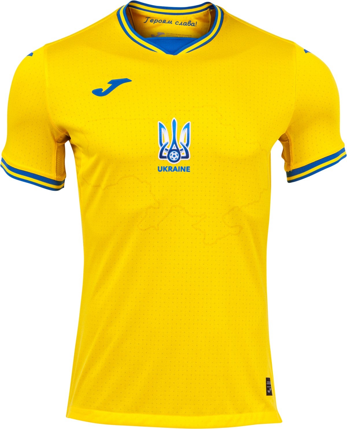
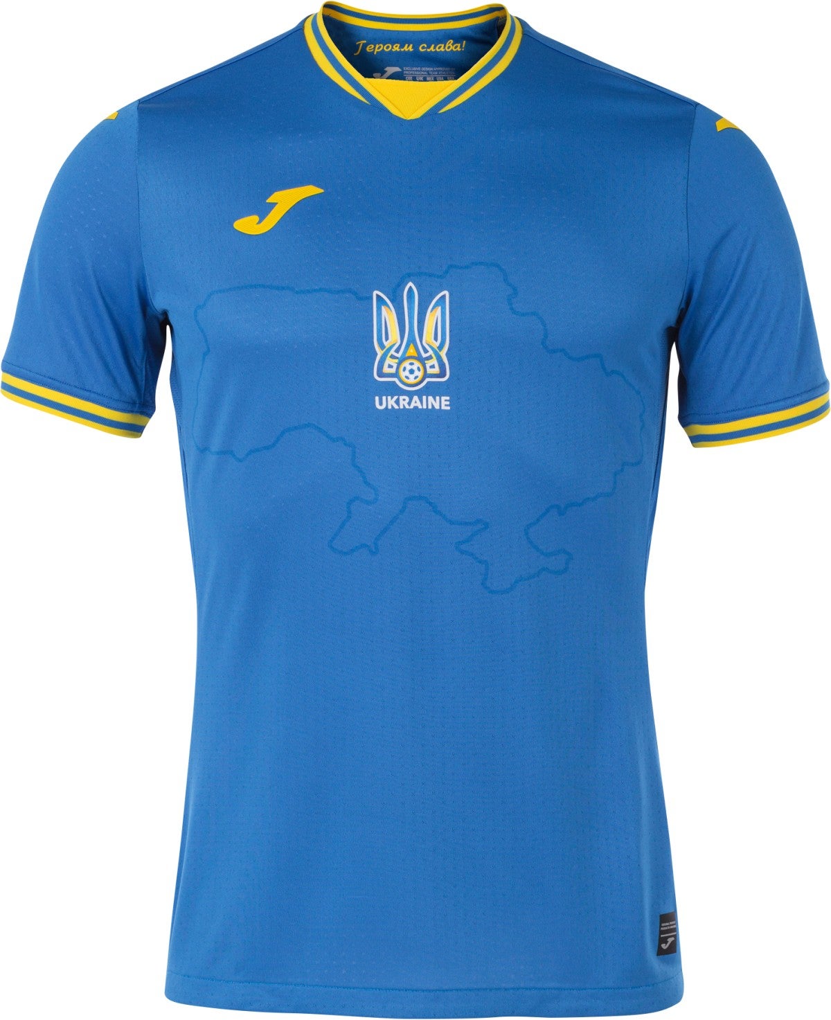
Ukraine home & away
Lumped together because they mirror one another, these are sharp shirts and the Ukrainian border depicted in the background sends a powerful message.
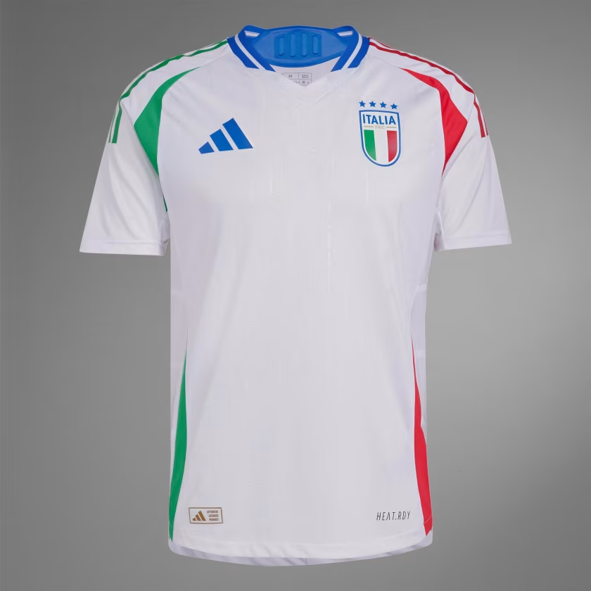
Italy away
Despite the relatively simple design, there’s quite a lot to take in here with the various colours in play. It all just about comes together, though, and we approve.
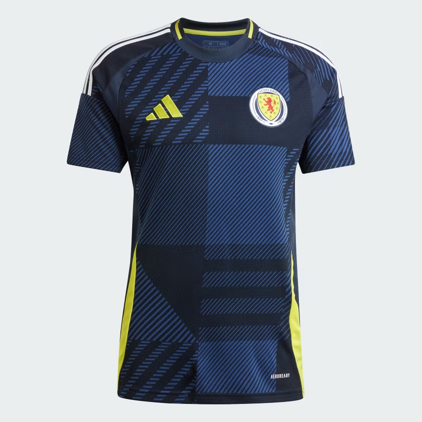
Scotland home
Great colours and the bold background pattern is arresting. It would make a nice carpet at Center Parcs. There is also the faintest hint of Euro ’96 here which reminds us of Colin Hendry’s flowing locks, and this is pleasing.
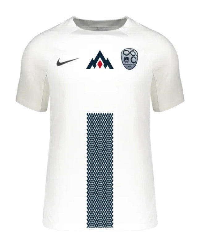
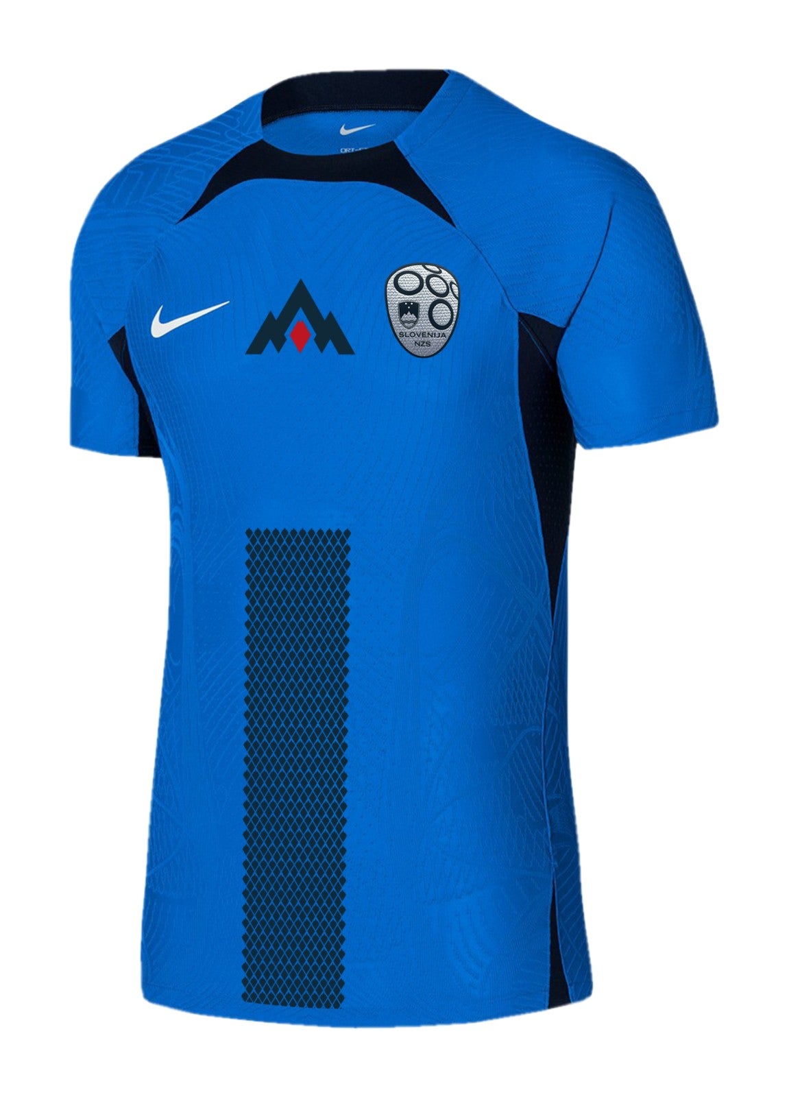
Slovenia home & away
We like the mountains.
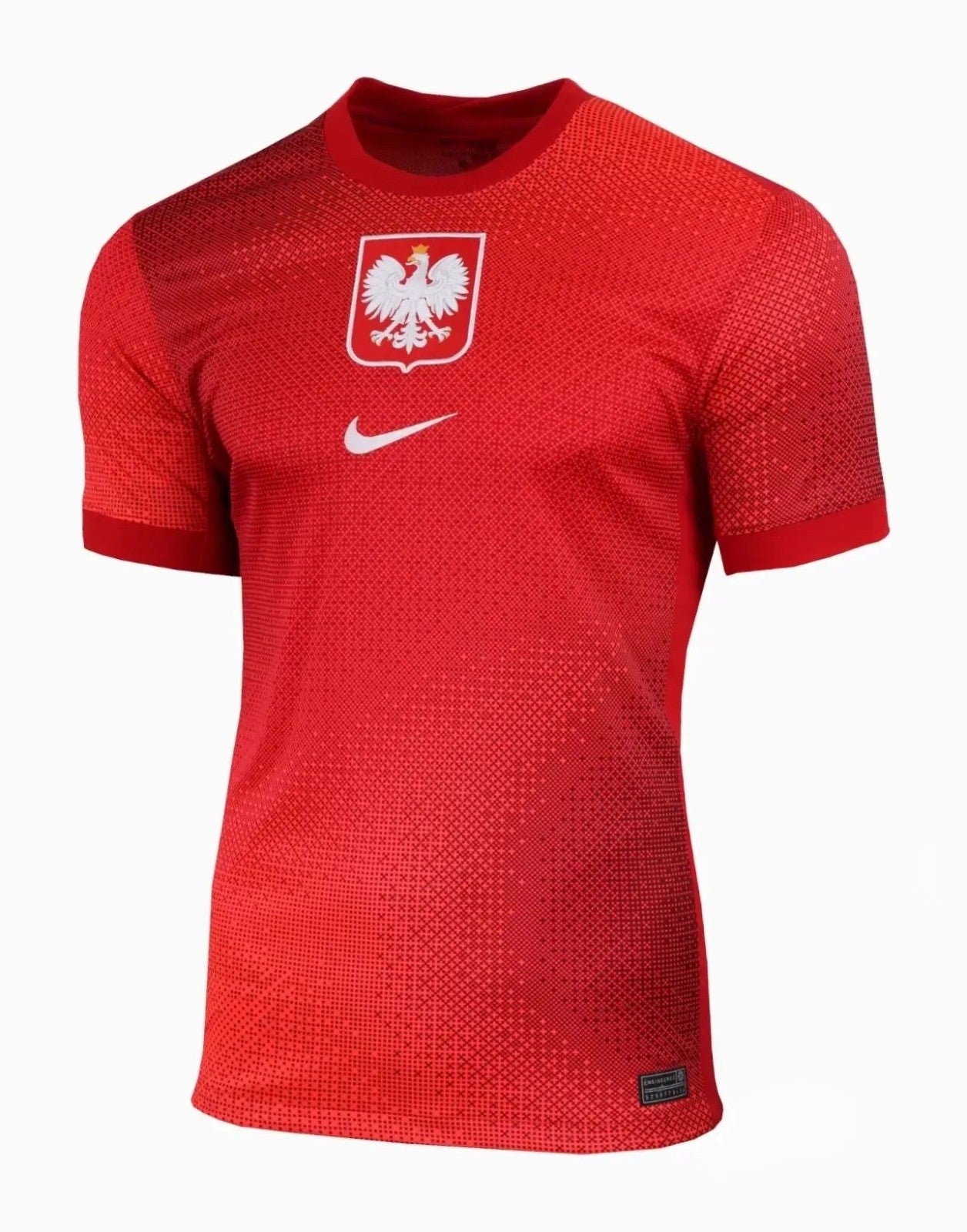
Poland away
Having offered up a very plain home shirt that you will probably have forgotten by now, Poland have produced a quite dazzling away strip to more than make up for it.
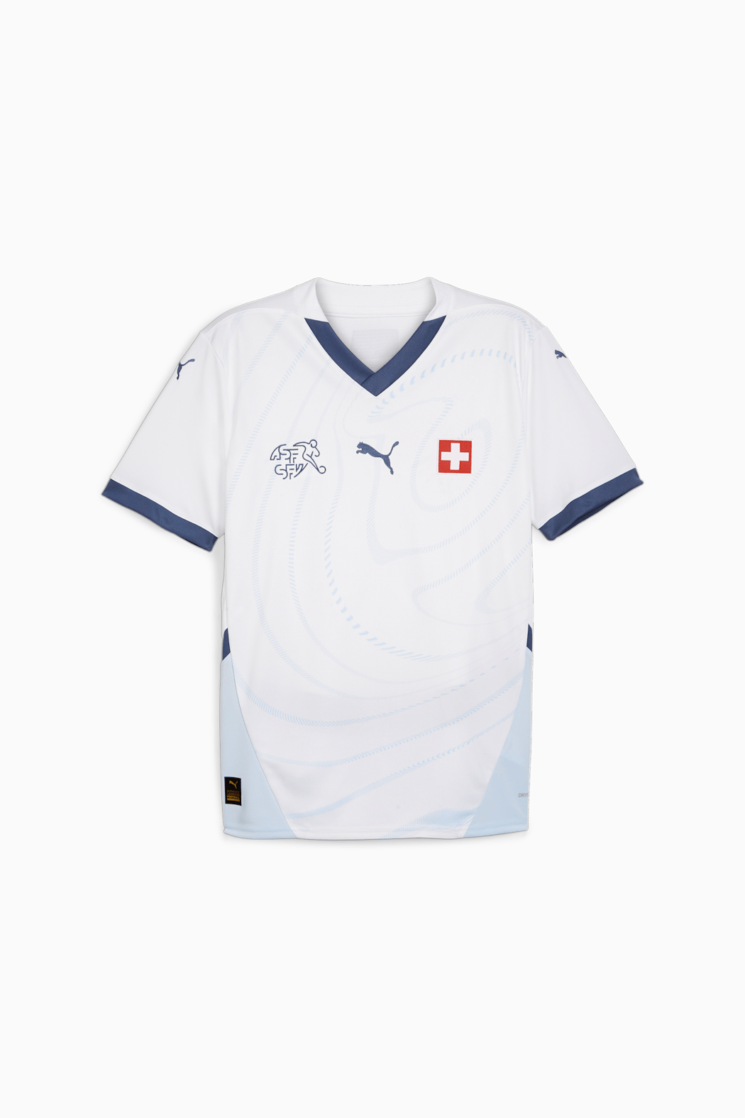
Switzerland away
Puma’s away kits are a little bit cut and paste this year (see Czech Republic and Austria), all white with some slight tweaks. This one is nice, and the badge is a big plus.
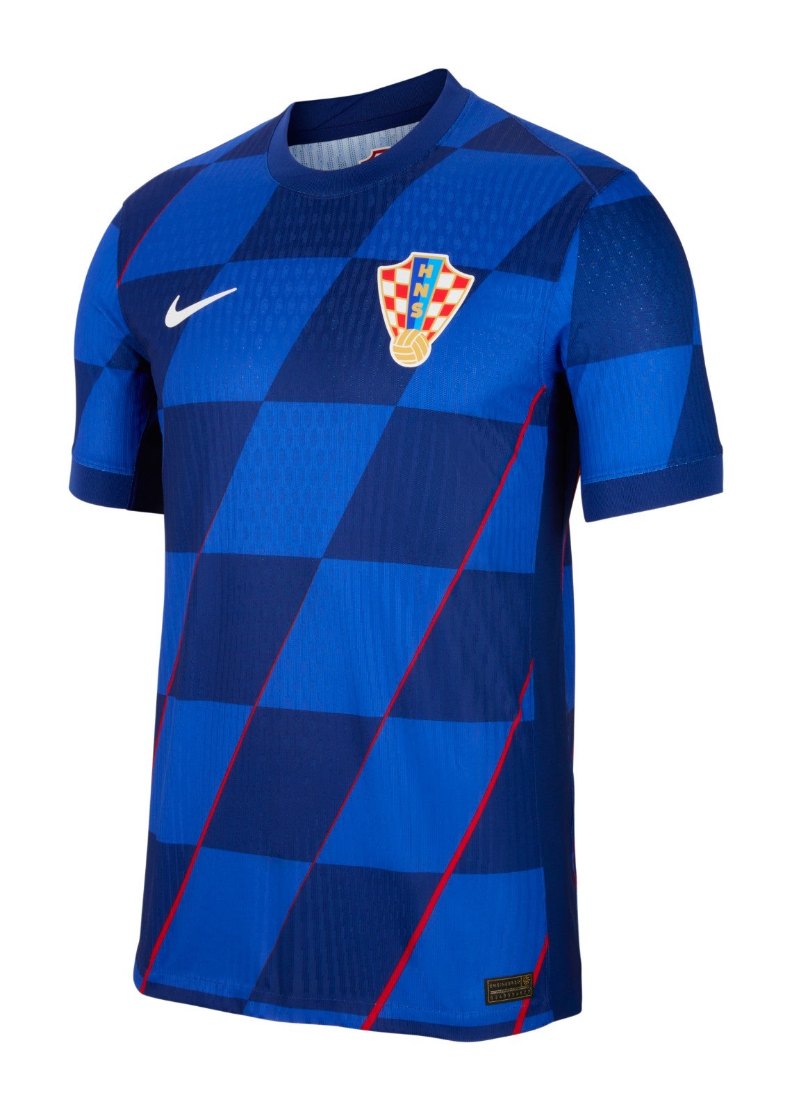
Croatia away
Diagonal checks? Neat. Red laser lines? Intriguing. We couldn’t stay mad at you for long, Croatia.
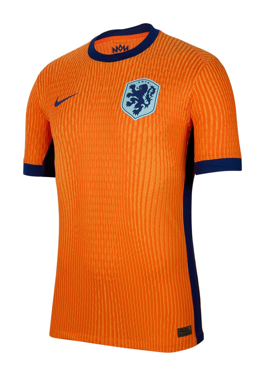
Netherlands home
Good clean fun from Nike here, and a big improvement on the garish shade of orange at the Qatar World Cup. The faint stripes are unusual but acceptable.
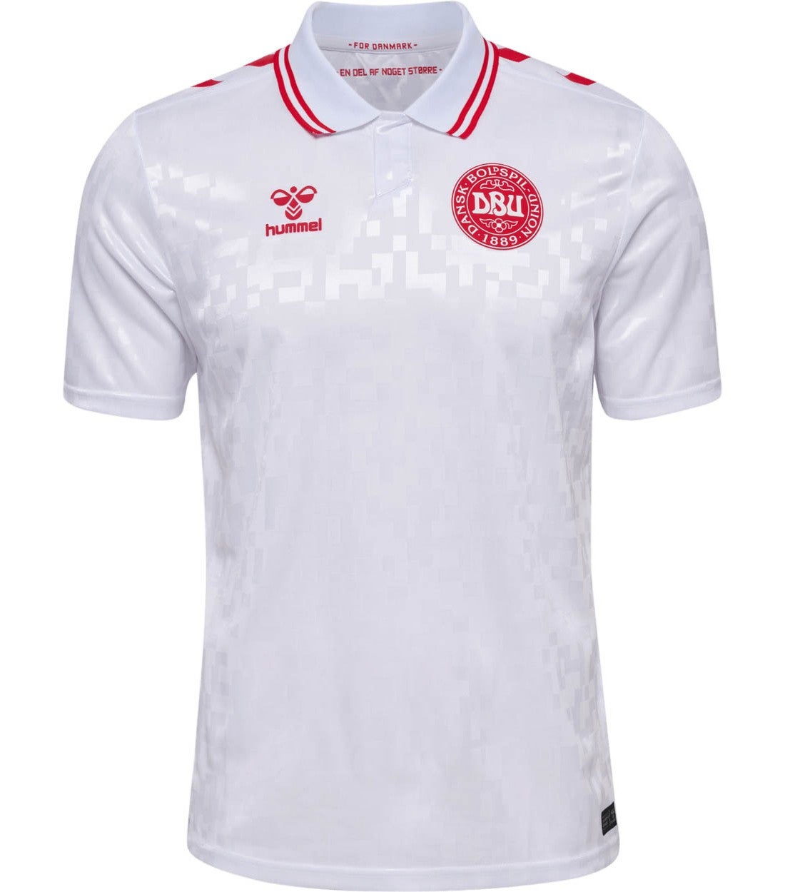
Denmark away
The collar is a smart element that differentiates this from the home version, coming up later, but a few more flashes of red trim would have elevated this one.
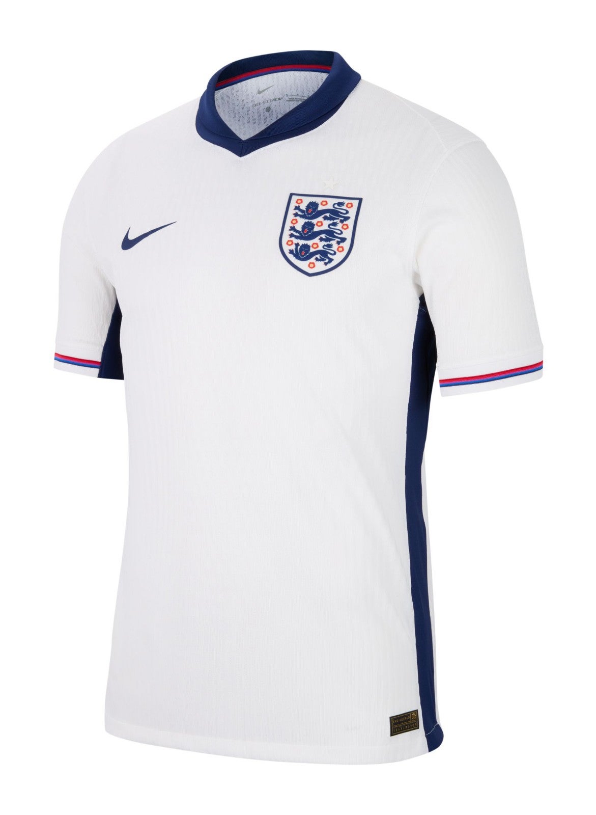
England home
The zany St George’s Cross infuriated all the right people, but this shirt’s strength is actually in its red and blue sleeve trim – a lovely detail.
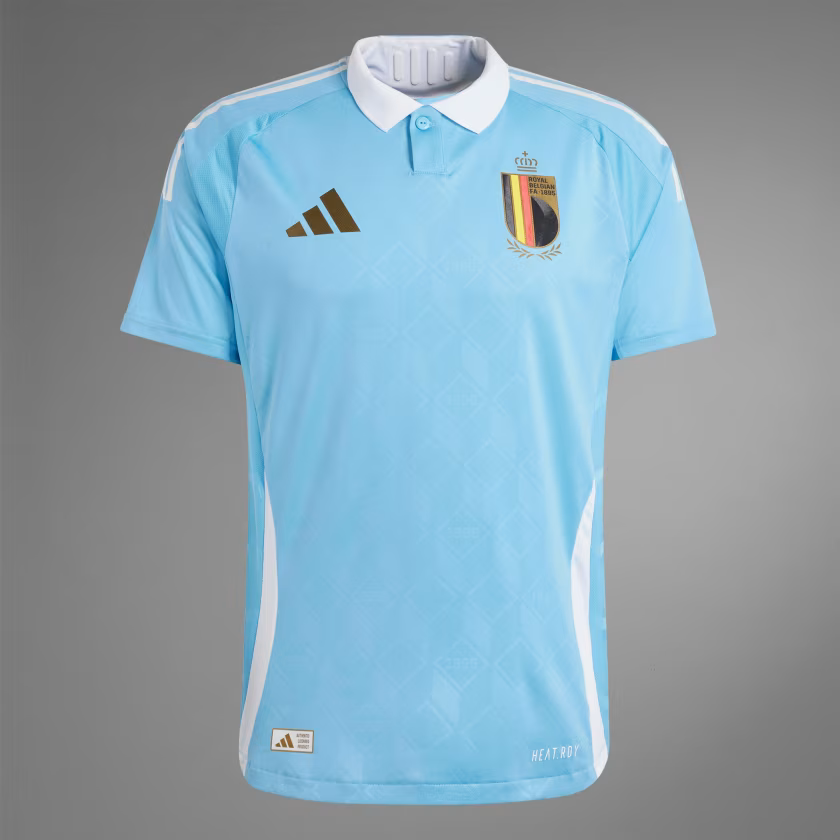
Belgium away
There are three elements we need to address here. The first is the fact that this kit is based on the Belgian comic book character Tintin, which is a slightly mad but quite lovely idea. The second is that the shorts are an ugly brown because they’re based on the Belgian comic book character Tintin. The third is to consider the shirt in isolation, which is a nice-looking thing. We can’t help thinking Kevin De Bruyne’s international legacy deserves more than a novelty costume, but overall we like it.
Serbia away
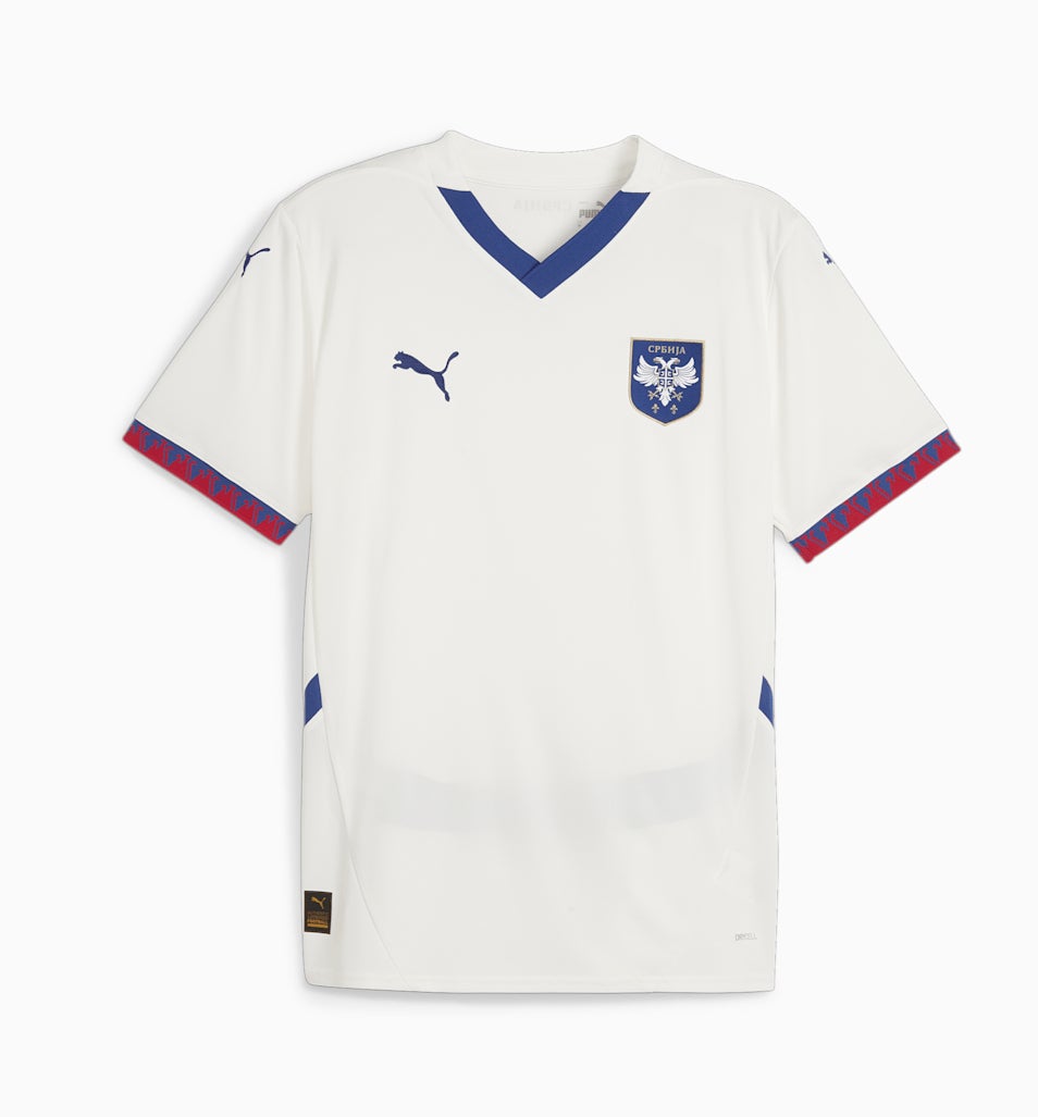
A smart-looking kit made excellent by the jazzy sleeve trim. At first glance it looks like a lovely bit of serration, but zoom in and they are actually flames, or at least making a flame-ish patten. Either way, it’s a nice touch.
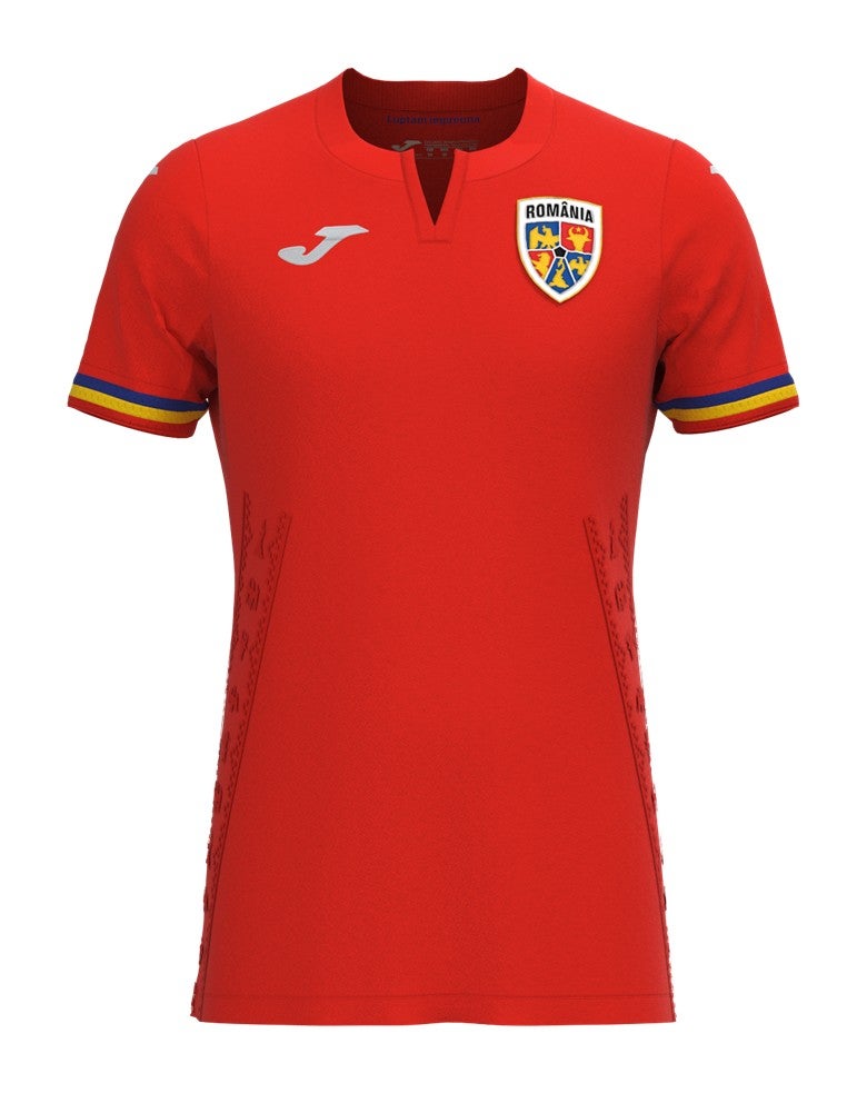
Romania away
This is very similar to the home shirt, coming up later, but we prefer the yellow to the red. We’re also not totally sold on the collar.
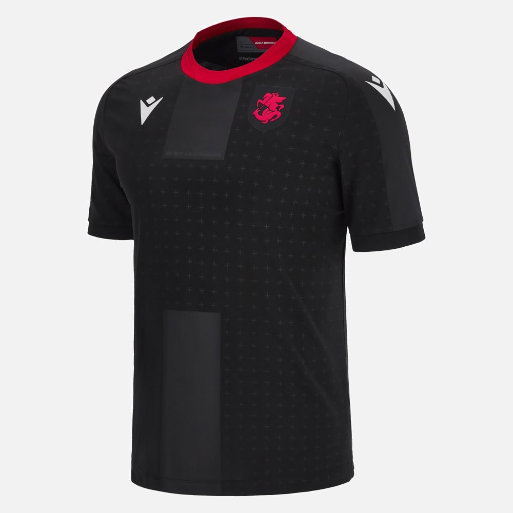
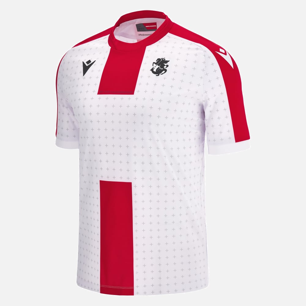
Georgia away
As a rule, black kits almost always look good, but we particularly like this from Macron – the little white crosses in the background, the flashes of red, the white logo. It all comes together for a threatening aesthetic.
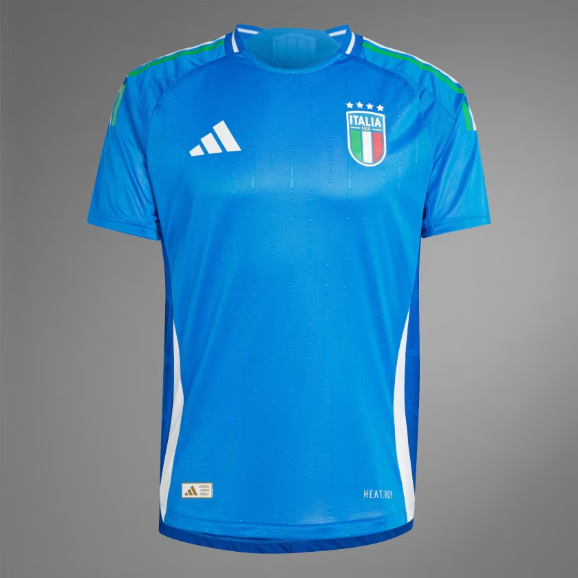
Italy home
You can’t quite see it here, but the shoulder trim consists of narrow lines of red, white and green and they look smart, although as with many of this year’s kits, the shade is a touch lighter than is traditional. Andrea Pirlo could make this shirt look very cool, but alas, he’s not around so it’s just “broadly nice”. In fairness, Italy face an uphill battle every time because nothing will ever touch their ’94 shirt and the iconic sight of Roberto Baggio’s ponytail flopping over his collar. Heady days.
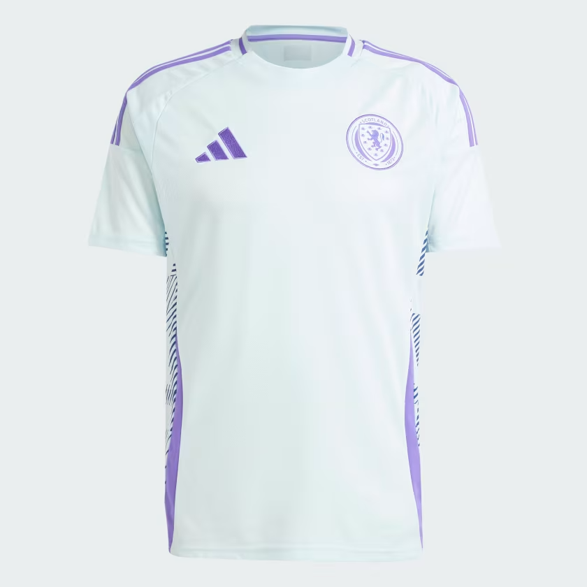
Scotland away
The purple is fetching, as are the fruity patterns down the sides. Very good.
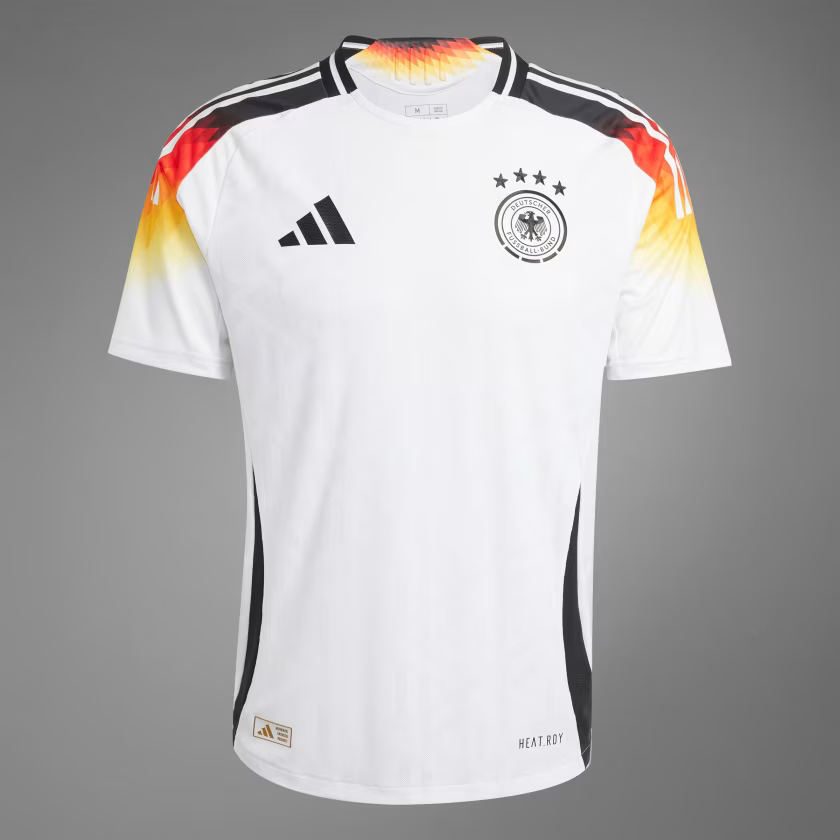
Germany home
This has hints of Germany’s classic 1994 shirt, where Jurgen Klinsmann looked absolutely divine in those red, yellow and black shoulders. We could do without the fading pattern but still, England are almost certainly losing to this thing in a valiant semi-final exit.
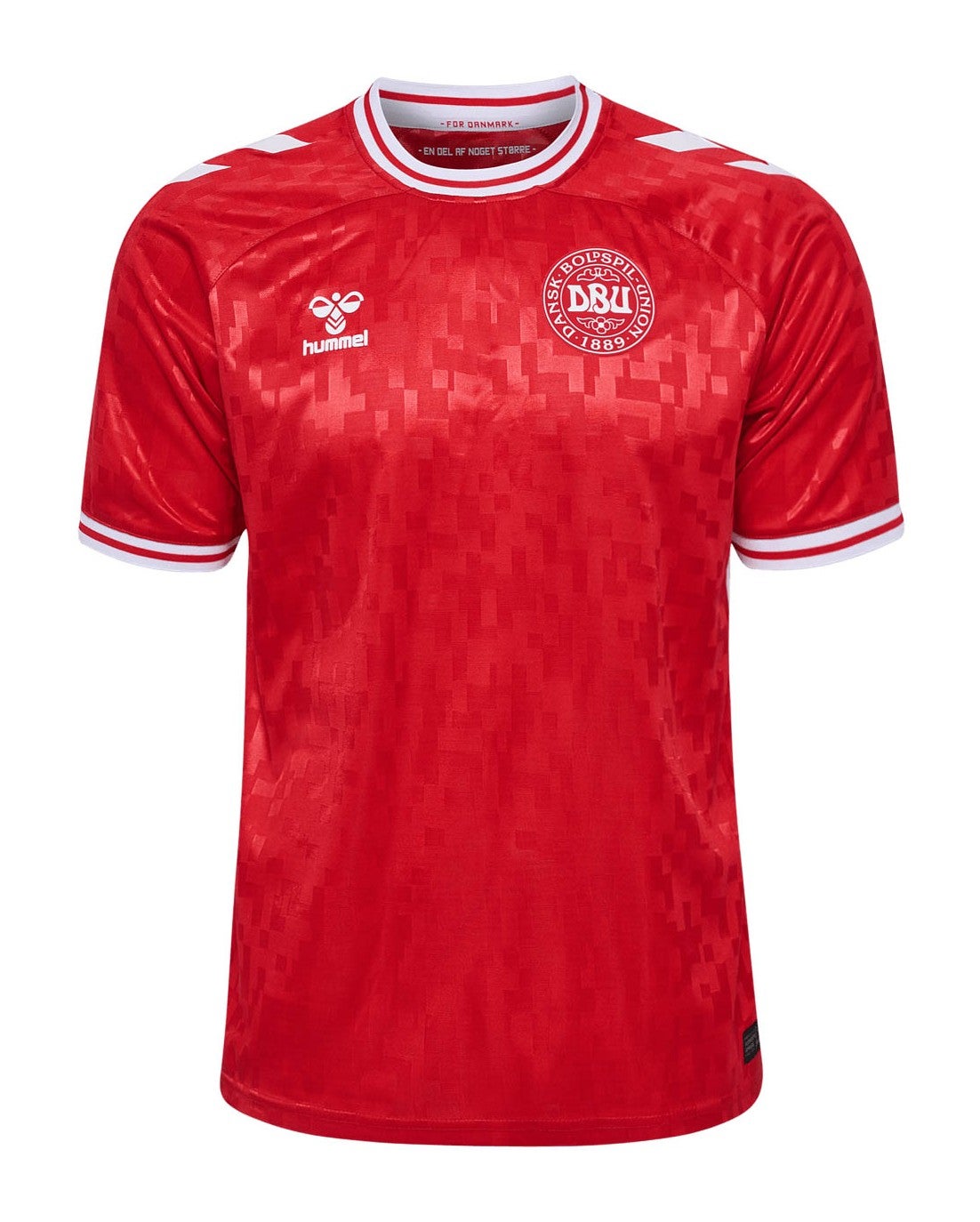
Denmark home
Hummel are maestros and they make no mistake here, hitting all the right marks with this shimmering shirt. We can picture Christian Eriksen hitting the first man at a corner while wearing this little number.
Albania home & away
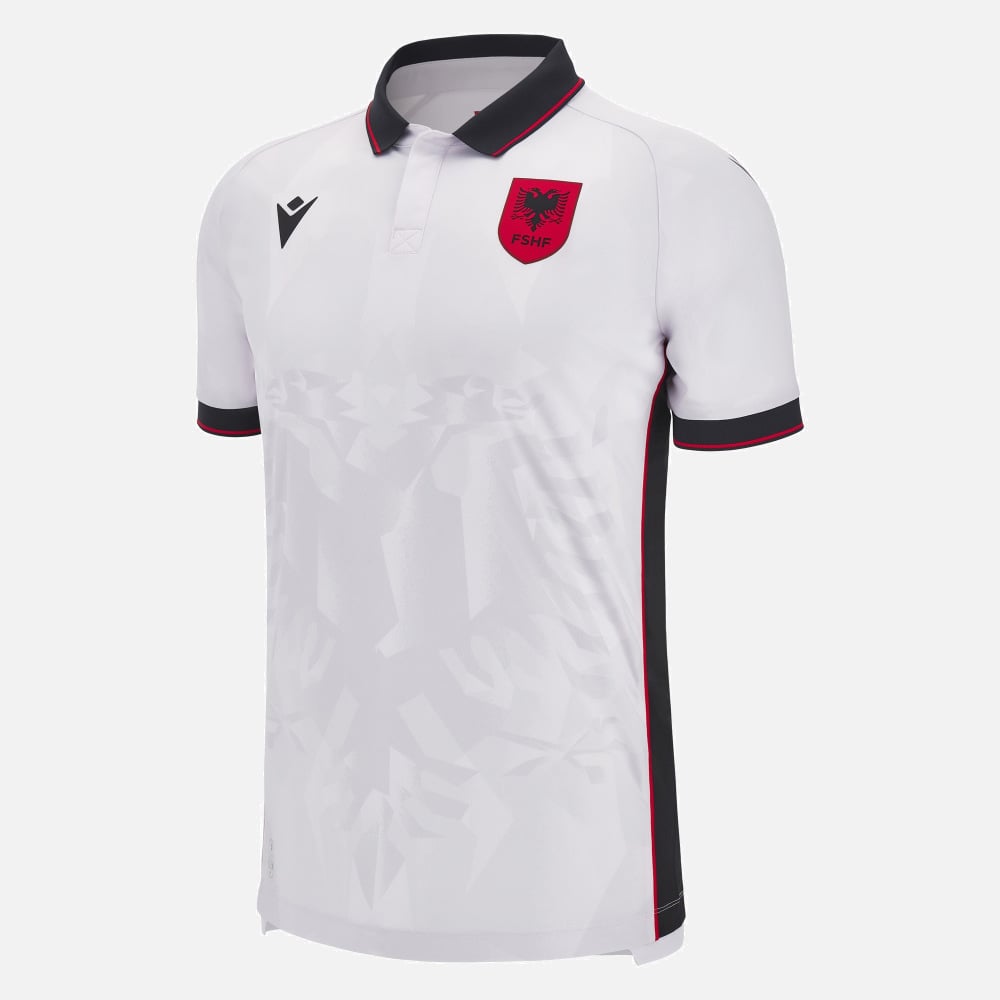
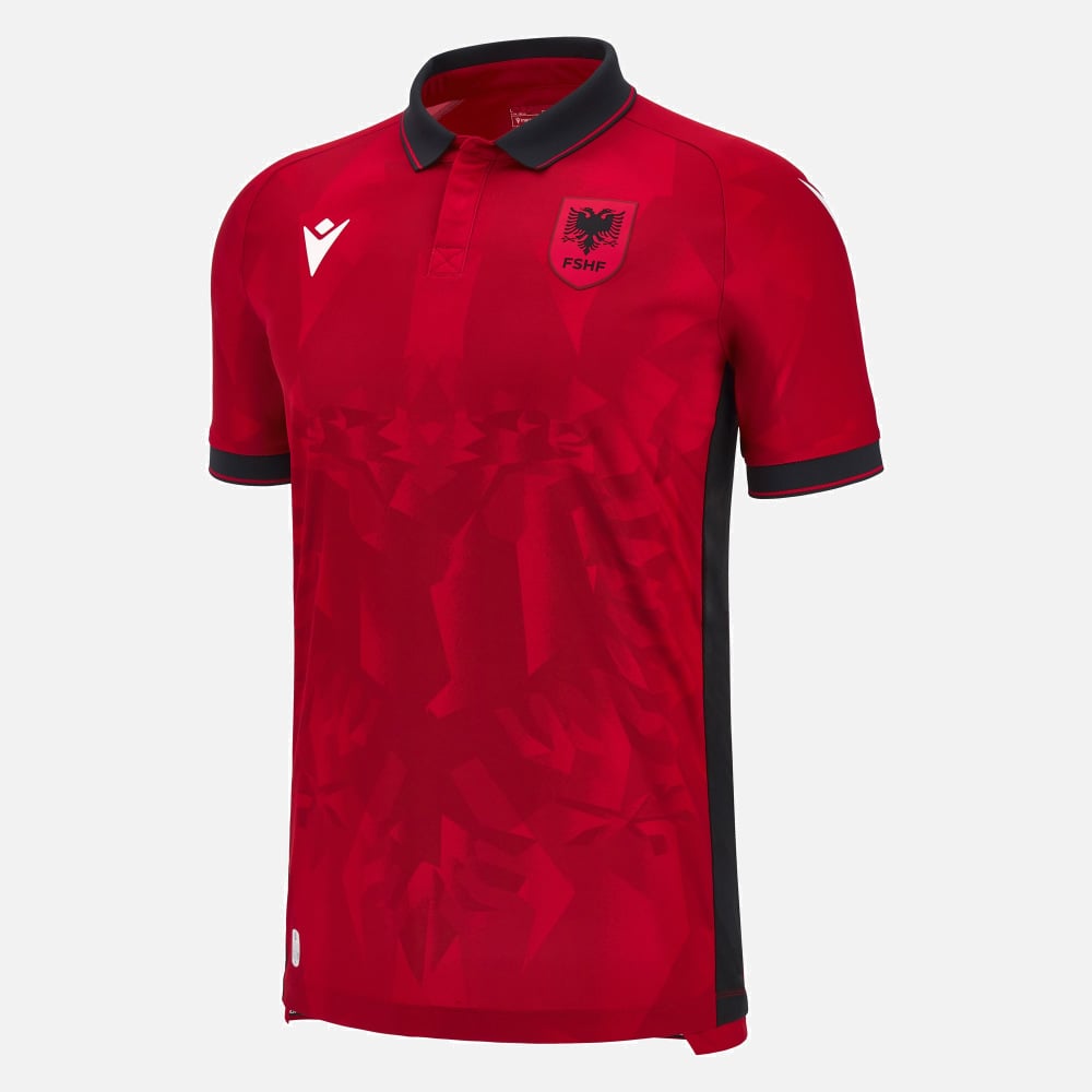
There are not enough collars in modern football wear, but here’s a fine example by Macron for Albania. The home and away editions are identical bar the change in base colour, so we’ve lumped them together, though we particularly like the blood red.
Romania home
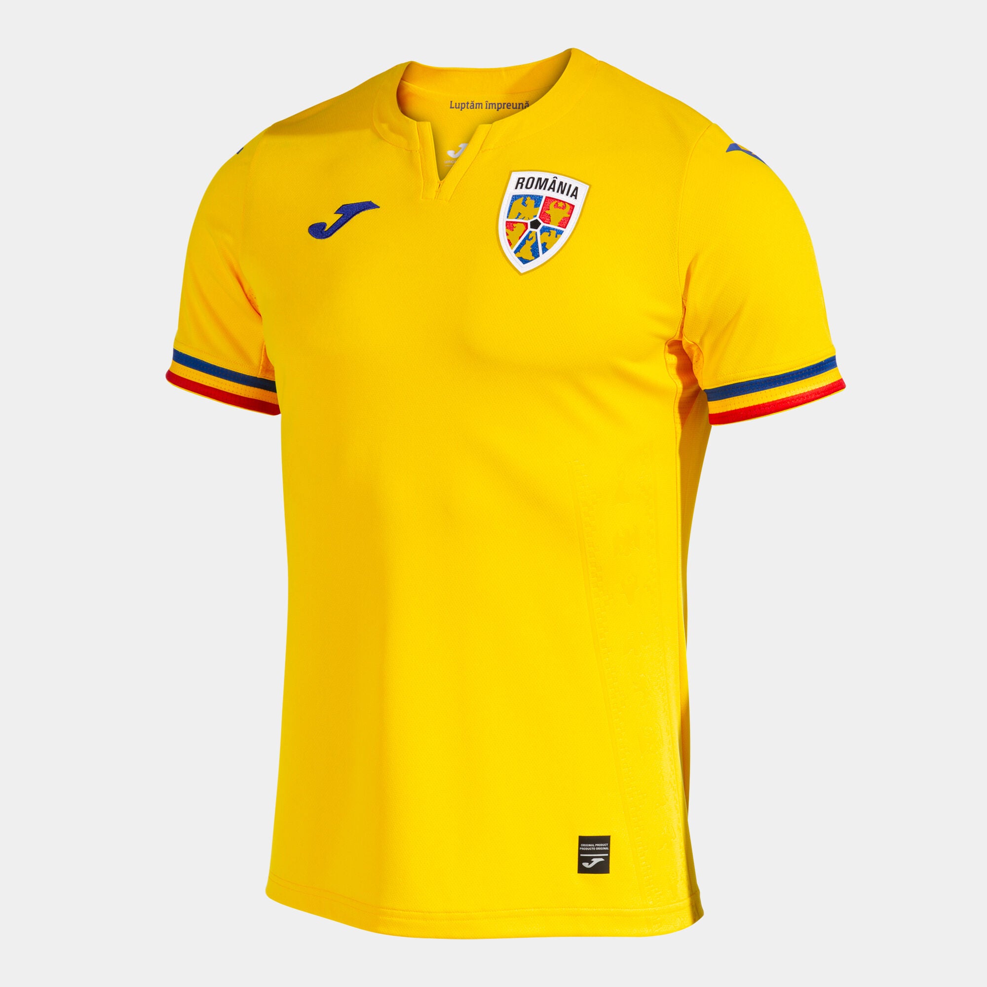
Romanian yellow is a great shade and the sleeves are delightful.
Portugal away
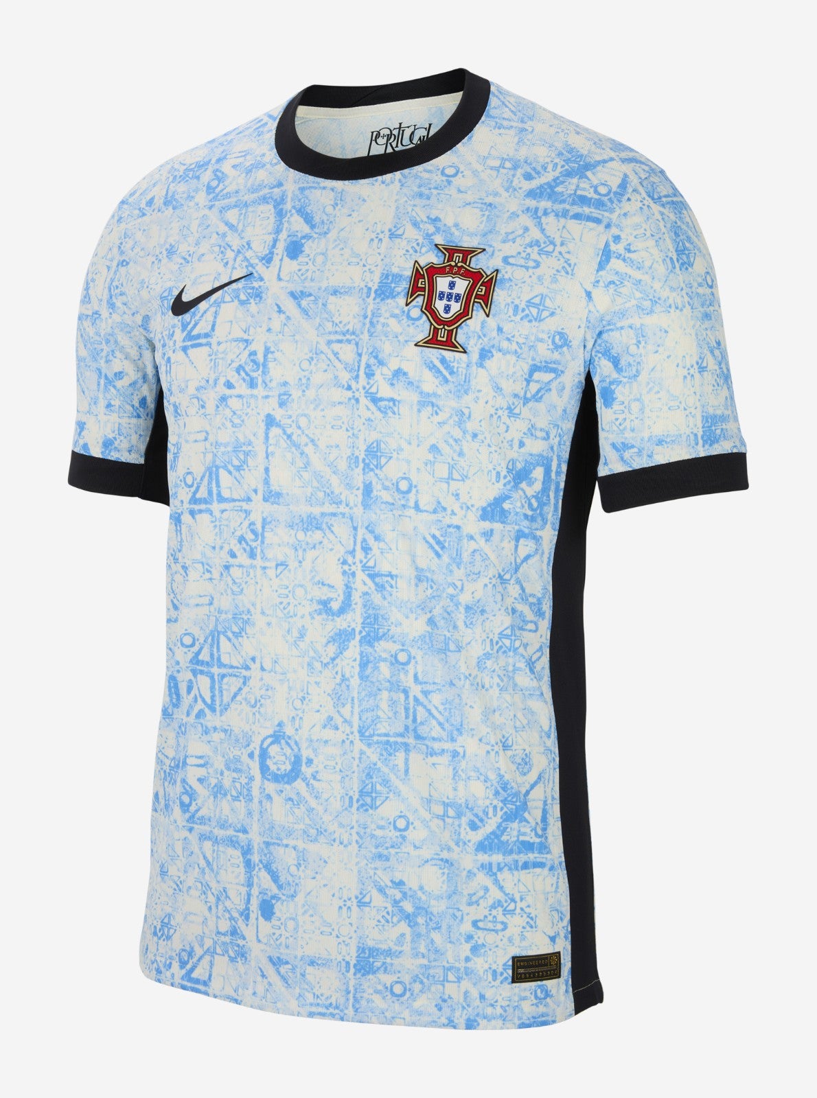
This kit takes inspiration from the distinctive azulejo tiles, we’re told by Nike, which are found all over the country. It’s natty and we like it.
Georgia home
This is great from Macron, playing with the Georgian flag to create something a little different from the rest.
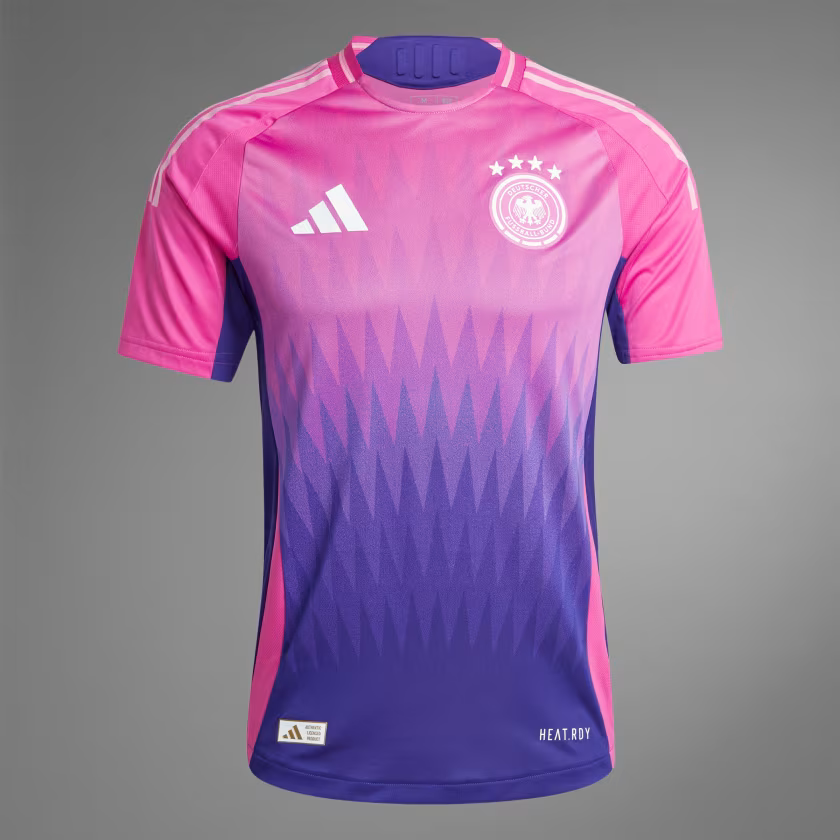
Germany away
We have been staring at this one for a while. It’s… quite something. The design is jazzy, the collar is funky and the colours are very bold. Crucially, Toni Kroos will make this look great.
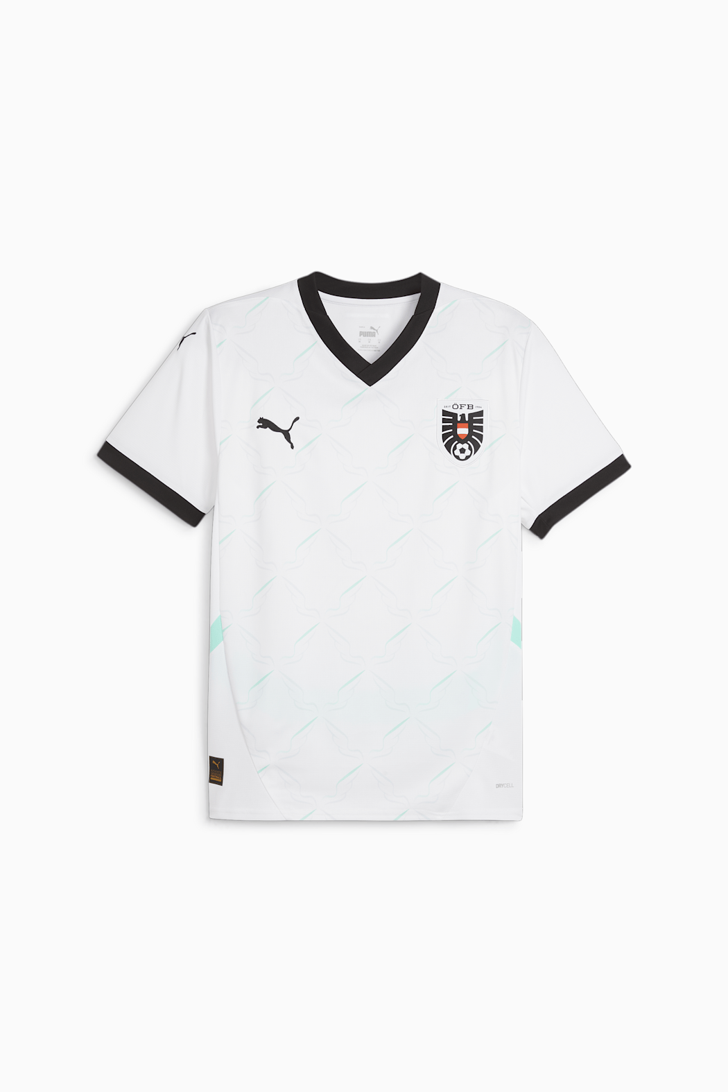
Austria away
This is by far and away the best of Puma’s offering for Euro 2024, mainly because the faint green pattern works so well against the intimidating splashes of black.
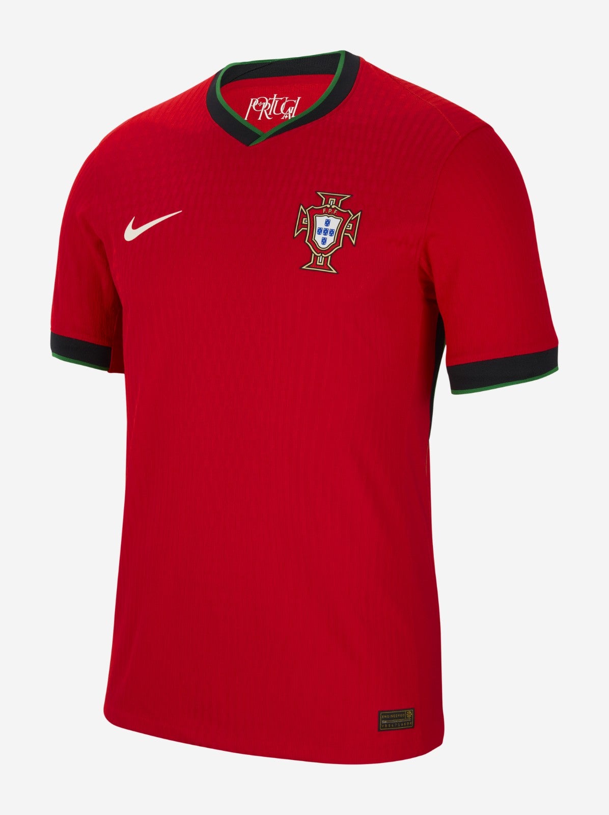
Portugal home
The beautiful stock Portuguese home colours do a lot of the hard work here and so Nike have rightly chosen to keep things simple. The dashes of green on the collar and sleeves are a lovely touch. It has an almost regal quality. Also, an elite crest.
England away
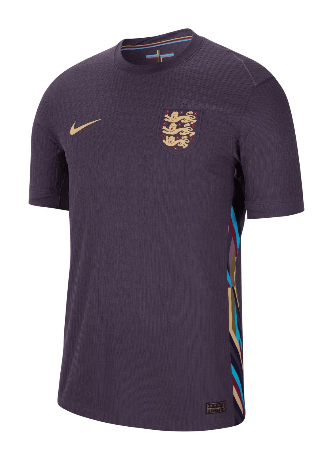
England away editions are reliably better than their home siblings, but if you’d told us England’s away kit for Euro 2024 would be purple with multi-coloured side panels we would have raised a concerned eyebrow and begun carving out a space near the bottom of this list. But good lord, what a shirt this is. The colour is almost intimidating. The golden flecks of detail in the Nike swoosh and Three Lions badge are rich and dreamy. The simplicity is art itself. If you could marry a football shirt…
France away
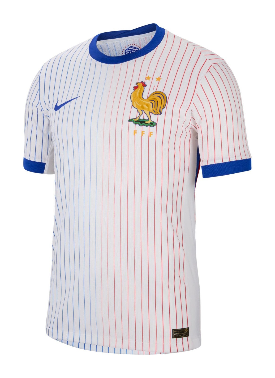
You know all those mean things we said about the French home shirt? Well none of them apply here. Pinstripes are a risky business on a football kit but this is an elegant finish, with sharp blue trim offsetting the white background beautifully. The massive cockerel is somehow less gimmicky than the home shirt, perhaps because it fits with the baseball aesthetic. It’s New York Yankees meets Les Bleus. It’s Lou Gehrig meets Antoine Dupont. We have our winner. Chapeau.
